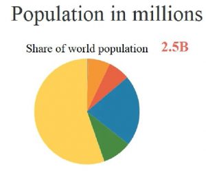
 This is such a cool little tool. Our friend, Justin, shared it this past week. Just click on the graphic pie chart to see the animation.
https://www.reddit.com/r/geography/comments/8dzfsw/population_growth_in_this_century_will_be/
(Thanks Justin! Learn more from Justin at www.justinlong.org .)


link doesn’t work
Please try again, Blake. It worked for us exactly as published. Might have been a temporary outage on your end of the internet?